Firstly, why prototype a website? For the same reason builders have blueprints, financiers use models and movie-makers pen screenplays and leverage pre-visualization. After the definition phase comes the design phase. Thoughtful design can save time, money, and head space for production crews. When it comes time to start shooting a movie, filmmakers would rather concentrate on creating the vision and not break stride by having to rewrite lines and scenes. One responsibility of web design is to answer as many questions as possible prior to the development phase. It’s a lot easier to alter a design than it is revamp an entire wing of a half-constructed house.Let’s prototype!
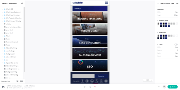
Before I proceed, for anyone interested in prototyping, I’m using Invision Studio. However, there are other viable tools to choose from; just search the web for prototyping tools and services. If you want to take Invision Studio for a test drive, the Invision Introduction page is a solid place to start. Here's a link to the Invision studio file for anyone who would like to poke around the file structure.
While I've included screenshots, you can follow this link to check out the interactive prototype in order to get a feel for the prototyped experience.
In this example, I’m pulling together a website prototype to test the potential for informative flow and delight when it comes to presenting a small array of solutions for potential customers. We’re gonna try the supermarket model. Our goal, on a handheld mobile, is to present all available services to users, at a glance, in order to let them peruse quickly without being inundated with in-depth details.
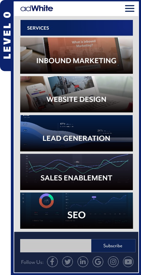
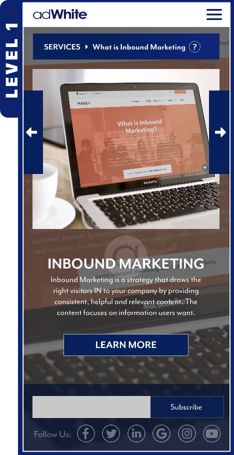
Like the supermarket, the first view of products on the shelf enables customers to scan and glance at the available options. Is there something here that I need? Labels designed to convey initial, compelling, informative impressions assist in getting a customer’s attention and help them decide if an item is something that pertains to their search for solutions. Both our initial, level-0 overview and level-1 preview (images below), give our users a chance to get their bearings and scan for what might interest them. If levels 0 and 1 are pertinent and compelling enough, a customer will be more likely to pick an item up off the shelf and engage in the lengthier label information, typically on the back of the label, which we’ll call level 2.


Level 0
This is the initial services view, where five areas of specialty are presented with low textual overhead, maximized screen real estate, and respective visuals. Decision-making is low-intensity as there are only five primary choices, each with large tap-targets and, as you’ll see in level 1 views, the ability to quickly go back and forth to each option is a breeze.
Level 1
There are five level 1 views because there are five services. The textual overhead has been upped, but only slightly. We’re only presenting the audience with the main point, so that they can learn what the service is if they didn’t know; or if they do know, they can confirm their understanding. Now that they have an idea of what the service is, going back to our supermarket analogy, they can make their decision on whether or not to pick the bottle up off the shelf, turn it around and read the lengthier information on the subject matter. By tapping “learn more,” they can leave level 1 and head to level 2, which is the in-depth page presenting the respective service’s overview.
Both level 0 and level 1 views share components in an effort to keep the user oriented to where their current position is in the site structure. Some of them also offer methods for backtracking. Service titles and graphics visually carry over from level 0 into level 1 views to reinforce user bearings. Both levels also include a blue title bar, which updates based on the view the user is currently experiencing. The title bar is responsible for informing the users where they are, and for providing a method for backing out to level 0, no matter which level 1 view they are viewing.
While this is a small example of website prototyping, you can see how powerful a representation these rapidly developed prototypes can offer when it comes to envisioning the final product. Prototypes give developers, designers and stakeholders a chance to make decisions on the feasibility of certain features, analyze the time required to produce, cost considerations, technological considerations, etc.
During testing, users who are given a set of tasks to try and accomplish will benefit from a robust interactive experience, and clients can get a real feel for the direction of the project and sign off on high-fidelity pre-visualization. Many of the services that accompany prototyping tools include the ability for other users to make notes on the designs, and developers can access many of the visual styles the designs use, all from the services dashboard.
I wanted to share this via a blog post because I think it's easy for people to think that not much goes into a website design and that's simply not true...if it's done right. User experience is important and I believe that prototyping a website can help the viewers of websites I design get the information that need quicker and easier.
If you want our help with your next website design project, contact us.

