For marketers, the primary responsibility of modern web design and development is to convert leads and produce results. Websites aren’t brochures anymore, they are interactive drivers that bring together businesses and customers via a thoughtful experience.
Before any design begins, a talented crew works hard with clients to uncover their business goals, develop carefully crafted user personas (representations of ideal customers), familiarize themselves with the prospective buyer’s journey, analyze existing content, create new content, gather assets, etc. All of this information helps inform the design and execution of a successful online presence.
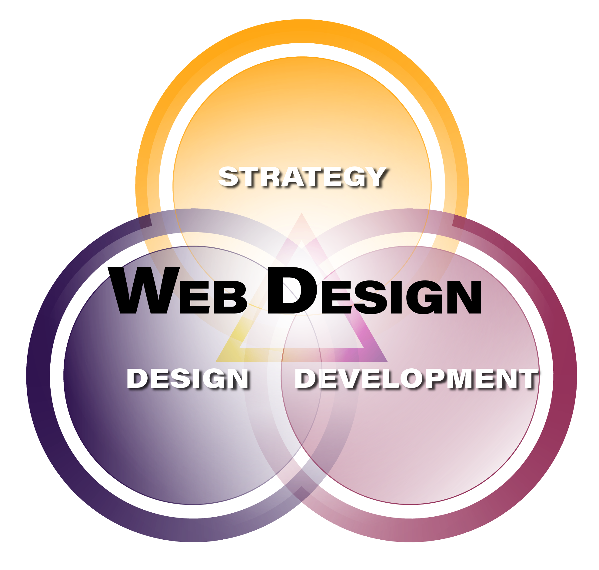
Three Fundamental Aspects of Web Design

Strategy
Strategy involves disciplines such as information architecture, user research, project management and web analytics. Some responsibilities of the strategy phase are to outline requirements, define pertinent web metrics, identify existing customer pain points and design user flow.
Web Design
Sometimes, some people, conflate design with decoration, but the design is not frosting on a cake. The responsibility of web design is to create a clear path for a business’s ideal customers to find the solution to their problem. Modern web design is about crafting experiences, not themes or brochures. Color, type, space, scale and composition are tools leveraged in the effort to draw attention and guide users intuitively, help them reach their goals and make informed decisions.
Professional designers use their skills and tools to execute solutions based on proven design patterns, established design principles and sensory psychology. For example, Hick’s Law states that the time it takes for a person to make a decision as a result of the possible choices he or she has; increasing the number of choices will increase the decision time logarithmically. Design is more about having the discipline to say "no," much more often than "yes." The goal is to help users find and focus on what they are looking for, not inundate them with a truckload of information straight away. User flow and pacing is important.
Another example principle is the aesthetic-usability effect. This describes a paradox that people perceive more aesthetic designs as much more intuitive than those considered to be less aesthetically pleasing. This last example works best when used along with a solution that is actually intuitive in function and appearance. Poorly formulated solutions will eventually show through even the shiniest exteriors. Combining aesthetics with thoughtful functionality and a professional-looking presence not only helps establish credibility, it becomes even more intuitive to use for every user it delights.
Designs begin with wireframes; this is the "napkin" stage. Wireframes are low-fidelity representations of the site that outline basic chunks of layout and structure. This stage prevents anyone from getting hung up on details.
The next stage is designing and producing mockups. At this point, the look and feel of the site takes shape. Mockups are responsible for presenting the overall aesthetic.
Lastly come the prototypes. Prototypes are high-fidelity representations of user interaction simulations, which enable user flows and other aspects of the product to be tested. It’s a lot quicker to retool and retry missteps discovered from testing prototypes than it is to undo or redo entire segments of intensive web coding.
Web Development
Now that the blueprints are finished, it’s time to start pouring concrete and nailing together boards. At this phase, the team begins to breathe life into everything that has been created, designed, strategized, devised and visualized up until now. One benefit of the previous stages is allowing the logical, “coding mind,” to function best by not having to interrupt itself to make a content, design or other analytical decision unrelated to site construction. Consider the headache of rewriting a movie scene halfway through filming. It happens, and the problem is surmountable, but the less rewriting, the better. That’s why preproduction/design phases exist.
Web development is not invisible voodoo. There really are things going on behind the scenes of a website that make a big difference and can be customized to help further a particular business’s goals.
Some still believe websites are just cake frosting (just put some pictures in the boxes and choose a typeface), or that custom coding is voodoo that website builders already have a handle on. The best avenue would for those who think like that would be to head over to Wix, Weebly or Squarespace and try their hand at it. If the results of your DIY enterprise are a smashing success, then you may have found an additional calling! If not, it's time to contact the professionals.
