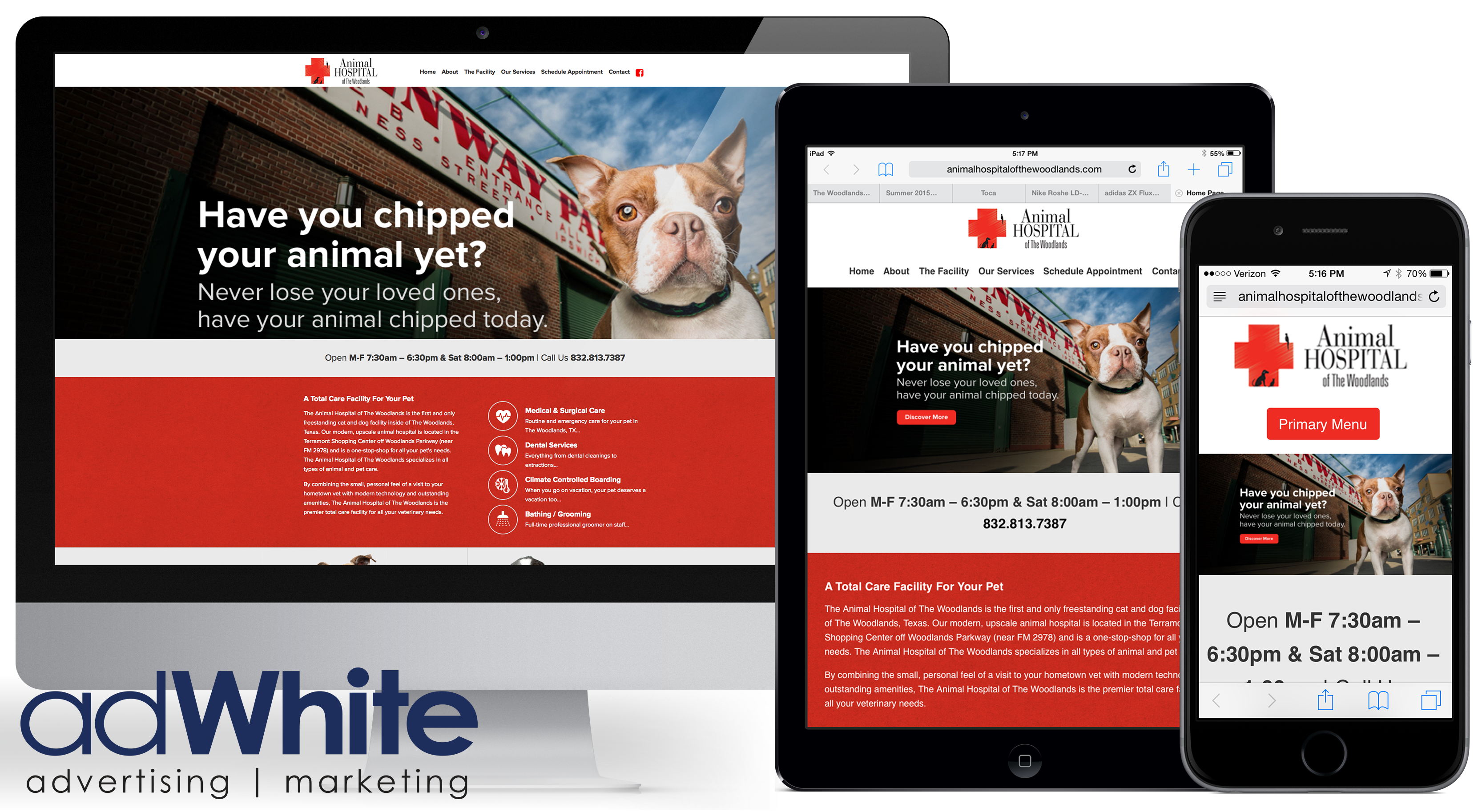
Resonsive Web Design (RWD) describes a website that adapts or “responds” to the device on which it’s being viewed. For example, the below website looks slightly different when viewed on a desktop monitor, tablet or smartphone. It’s designed this way to ensure the user has the best possible experience no matter how he or she comes to the site.

Example of a responsive web design we created for a client
Responsive designes are important for businesses, because there’s a strong chance most of your customers are viewing your website on their phones. In fact, last year Google reported that for the first time more of its searches took place on mobile devices than on computers in 10 countries, including the US. If your website isn’t optimized for mobile, you’re missing opportunities.
Of course, a responsive design is more than just a website in smaller font. It involves optimizing the viewing and interaction for the user including the content, scrolling ability, pictures, etc. The images are “context aware” meaning they’re optimized for the specific platforms.
Mobile users don’t like having to “work” to scroll across huge images. They’re a fickle bunch and get annoyed easily (I admit, guilty as charged). If the format isn’t easy to read and search, or if it takes too long to load you'll likely lose the user -- and any potential sales they'd bring as well.
If you don’t yet have a responsive website, now is a good time to make the shift. Just be sure to partner with a designer or agency that understands the intricacies of RWD. A good designer will ensure that it’s optimized for speed, which may mean using less graphics so it will load faster on a smartphone. They’ll also take “touch” into consideration for tablets and smartphones (as opposed to using a mouse). There are a lot of coding and technical aspects to be considered, so be sure to ask questions and discuss your specific needs and objectives.
You’ll also want to clearly communicate your design and functionality musts, whether that includes a shopping cart, calendar, events calendar or other. These, too, may fuction differently on differnt devices.
Finally, if you haven’t analyzed your web traffic patterns lately, take a look at Google Analytics (or whatever reporting tools you use) and review where you get the majority of your visitors. It will provide great insight into where and how users find you. The results may surprise you, and even support your case for optimizing your website.
If you need help creating a responsive website or optimizing your current site, adWhite would love to discuss your needs and objectives. We offer a free marketing assessment with one of our inbound experts.

