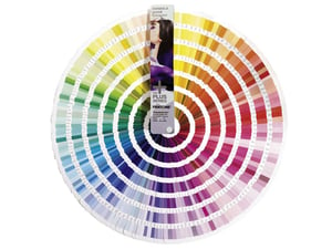
 The world around us is painted with a full spectrum of colors, each with different abilities to affect our mood in many ways, some subtle and some obvious. Marketers have learned how to use colors in both design and branding to elicit desired emotional responses. Here are some common colors and how they affect branding.
Red is an attention-getter. It’s often associated with excitement, danger, energy, movement and action. Many fast-food brands use red: McDonald’s, Burger King, Jack in the Box, Chick-fil-A. Picturing those red logos in your mind is probably making you hungry, right? That’s the power of red.
Although not as intense as red, orange is a close second. It’s often associated with warmth, fire, activity and danger. However, it’s also representative of the cooling season of autumn. Corporate logos well-known for orange include Harley-Davidson, Home Depot, Minute Maid and Texas favorite Whataburger.
All around us, yellow is found naturally in autumn leaves, corn, lemons and daffodils. It’s a bright, cheery color related to amusement, gentleness and humor (you’re thinking of a big yellow smiley face, right?), but it can be negatively related to caution and sickness. In many Asian countries, it represents happiness and wisdom. Some famous yellow brands include Hertz, Best Buy, DeWalt and Sprint.
Both vibrant and soothing, green is mostly associated with positive feelings of life, forward motion, spring and hope, and it connotates safety, growth and happiness. It’s the color most associated with nature and all things related to the environment. Especially in the western world, green means money and success. Think Holiday Inn, Starbucks, Whole Foods and Land Rover.
If you’re thinking loyalty, faithfulness, truth and confidence, you’re might be picturing blue. Many military uniforms the world over use shades of dark blue, and it’s also the dominant color of our planet as seen from space, since life-giving water makes up the majority of our globe. Blue provides confidence to logos from AT&T, IBM, Chase Bank and NASA.
The intermediate color between blue and red, purple combines the power and fierceness of red with the calm and stability of blue. Purple often represents royalty, wisdom, magic, mystery and seduction. FedEx, Cadbury, Taco Bell and Yahoo! all make good use of purple in their branding.
While blue is the color of water and sky on our planet, brown is the color of earth. It conveys comfort, security and dependability. Many food companies use brown to make a direct link to their products — think Hershey’s, Nespresso and A&W Root Beer. But the best-known user of this earth tone — UPS — is so well-known for the branding color that it even referred to it in its well-known slogan: “What can brown do for you?”
And colors don’t work their magic on just logos, but throughout entire websites and marketing campaigns. HubSpot recently did a color test on web-page buttons and found that a red CTA button outperformed a green button by 21% — so simply changing the color of a small element on a page drastically increased the conversion rate. That shows the power of color in marketing.
What do your brand colors say about your company or product? Are you making the best use of colors on your website to deliver the leads you need? Contact us today to learn how we can help.
